The 25 Most Beautiful B2B white papers on the planet
>
The 25 Most 📸 Beautiful B2B white papers on the planet
Marketers cannot afford to punish their audiences with boring, unreadable white papers. If you google search a popular subject matter like ‘technical white papers’, you are likely to find sexy, beautiful B2B white papers that engage the senses.
The competition for eyeballs is forcing marketers to think outside the box and redefine white papers according to the intended audience.
White papers are no longer ugly, unreadable documents. Instead, they now boast an array of splash pages and click-through buttons. Add diagrams, white space, quotes, and even emojis 🎁 into the body copy. You can add graphs, and depending on how you serve the white paper, animated graphs.
Companies creating beautiful B2B white papers
Organizations we found publishing🍬 beautiful B2B white papers were Google, Apple, Microsoft, Facebook, Linkedin, and Docusign. A few brands we researched but couldn’t find examples of beautiful B2B white papers included Adobe, Canva, Airbnb, and Hubspot.
Organizations that have a strong 💪 corporate identity were more likely to create beautiful B2B white papers. Organizations that did not have a strong corporate identity or had a history of not consistently following their identity were more likely to score poorly.
Further, we found that 🧐marketing white papers and digital transformation white papers were more likely to be aesthetically pleasing. We attribute this to the subject matter attracting creators who possess better creative resources and an eye for design.
The most beautiful B2B white papers on the planet
We qualified the 25 most beautiful B2B white papers based on the following criteria.
> ITSMA, FROM MARKETING TO ACCOUNT BASED MARKETING
> MADISON LOGIC, WHAT IS ACCOUNT-BASED MARKETING (ABM)
> SUPEROFFICE, THE CRM BUYER’S GUIDE
> LEADOO, CONVERSATIONAL PLATFORMS: LEADOO VS DRIFT VS INTERCOM
> ADMALL, SELLING DIGITAL MARKETING SERVICES TO LOCAL BUSINESSES
> HBR, MEASURING MARKETING INSIGHTS
> DIGITAL CLARITY GROUP, PHARMA MARKETING: CUSTOMER EXPERIENCES START WITH JOURNEY STRATEGIES
> BALANCE, DIGITAL TRANSFORMATION IN B2B ECOMMERCE WHITEPAPER
> RENOIR CONSULTING, POWERING SUCCESSFUL DIGITAL TRANSFORMATION
> MULESOFT, TOP 8 DIGITAL TRANSFORMATION TRENDS SHAPING 2021
> GOOGLE, TRANSFORMING SPECIALTY RETAIL WITH AI
> SOFTWARETRENDS, DIGITAL TRANSFORMATION DRIVES 2021 IT INVESTMENTS
> INCLUSIVE FINTECH 50, 50 INCLUSIVE FINTECHS
> COLLABARY, 4 TRENDS IN INFLUENCER MARKETING FOR FASHION BRANDS 2019
> TAKUMI, THIS INTO THE MAINSTREAM: INFLUENCER MARKETING IN SOCIETY
> KLARNA, INFLUENCER MARKETING WHITEPAPER
> SOCIABBLE, SOCIAL SELLING AT SCALE
> DOCUSIGN, EIGHT DIGITAL BEST PRACTICES FOR SALES
> DOCUSIGN, ACCELERATE SALES WITH A FRICTIONLESS AGREEMENT PROCESS
> TEALIUM, DATA GOVERNANCE: EMBRACING SECURITY AND PRIVACY
> FACEBOOK, CHARTING A WAY FORWARD ONLINE CONTENT REGULATION
> MICROSOFT, MAXIMISING VALUE WHILE MIGRATING FROM ORACLE TO MICROSOFT AZURE
> GOOGLE, THE GOOGLE CLOUD ADOPTION FRAMEWORK
> APPLE, MAC PRO TECHNOLOGY OVERVIEW
> LINKEDIN, WINNING AFFLUENT MILLENNIALS RESEARCH WHITEPAPER
1. ACCOUNT-BASED MARKETING WHITE PAPER EXAMPLE
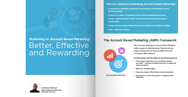
Titled Marketing to Account-Based Marketing Better, Effective and Rewarding, this one of the most attractive account-based marketing white papers we were able to find. This paper features a consistent two-column grid. Words appear in the main column located on the right-hand side of the page. Pictures break out and hang into the left column. The graphics are simple, large and the labels legible.
Sufficient space between lines of text breathes life into each page. Handsome splashes of bold color throughout adds contrast.
Overall, this B2B white paper weighs in at just over 10 pages making it a comfortable read.
Creators
ITSMA, Marketing to Account-Based Marketing Better, Effective and Rewarding
Description
Account-based marketing is a practice that enables B2B marketers to drive more revenue by focusing their marketing and communications efforts on the accounts (companies) that have the most potential to become customers.
2. ACCOUNT-BASED MARKETING WHITE PAPER EXAMPLE
This B2B white paper by Madison Logic is the second B2B white paper we found exciting on the subject of account-based marketing.
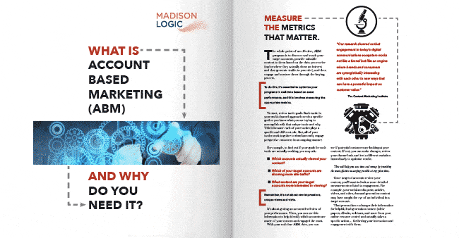
Titled What is Account-Based Marketing (ABM), this 7-page paper is brief and to the point. The design features several illustration styles including a broken line designed to connect related content. Bold black and white illustrations and red square brackets add contrast and break up the copy to make every page fresh.
The effect is a B2B white paper that feels more like an infographic than a white paper.
Creators
Madison Logic, What is Account-Based Marketing (ABM)
Description
Account-Based Marketing (ABM) is when you implement highly customized marketing campaigns where each account is considered to be a market of one. ABM uses the latest technology to help you send the right messages to influencers who are actively researching products like yours.
3. CRM WHITE PAPER EXAMPLE
Titled The CRM Buyer’s Guide, this B2B white paper is one of two beautiful B2B white papers we found on the subject of CRM. It was created by a mob called SuperOffice. SuperOffice is a cloud-based CRM platform.
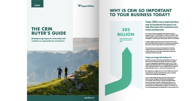
Bold use of graphics and typography creates surprise. Many of the charts are handmade making them original and interesting to read. Like the account-based marketing white paper example, a two-column grid has been religiously applied throughout.
The result is an easy-to-read and often intriguing B2B white paper.
Creator
SuperOffice, The CRM Buyer’s Guide
Description
CRM software helps your business to manage contact information in an organized way, making it easy to follow up on your interactions and activities with customers.
4. CRM WHITE PAPER EXAMPLE
Titled Conversational platforms: Leadoo VS Drift VS Intercom, this B2B white paper is another beautiful B2B white paper we found on the subject of CRM.
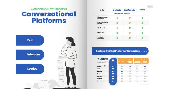
The bold use of color throughout keeps this white paper playful. Big splashes of color appear behind headlines. Bold use of color continues into the tables. Tables can often be cramped and dense, but the tables appearing in this white paper have lavish white space and an interesting array of icons.
The result is a B2B white paper that is easy to read on mobile and never boring.
Creators
Leadoo, Conversational platforms: Leadoo VS Drift VS Intercom
Description
To offer a fair and insightful comparison, we have chosen in this report to concentrate on the leading conversational platforms. This will include three of the industry’s strongest challengers, represented by the companies of Drift and Intercom, alongside Leadoo Marketing Technologies.
5. DIGITAL MARKETING WHITE PAPER EXAMPLE
Titled Selling Digital Marketing Services to Local Businesses, this B2B white paper is one of three beautiful B2B white papers we were able to find on the subject of digital marketing.
Unlike a lot of B2B white papers we found, attention was given to the cover design which carries through to each page within. Bold use of color begins on the cover and continues through to the content pages. Instead of a white background, this B2B white paper uses a grey tint behind words and pictures on each page. The typography and illustrations are bold and rendered full size.
The result is a B2B white paper that is easy to read on mobile and never boring. Congratulations AdMall.
Creators
AdMall, Selling Digital Marketing Services to Local Businesses
Description
AdMall’s latest Selling to SMBs survey reveals that nearly 22% of Digital Marketing Services buyers will hire outside marketing consultants or ad agencies to get the expertise they need. This statistic is similar to BIA’s Survey of Advertising and Marketing, 2 which found that 17% of businesses currently use help from outside agencies, and 37% are considering using one in the future.
6. DIGITAL MARKETING WHITE PAPER EXAMPLE
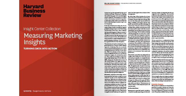
This B2B white paper was published by Harvard Business Review. HBR has a well-defined corporate identity, so it is no surprise why this B2B white paper is so striking.
The cover design is simple. Each content page is laid out with justified copy in a three-column that speaks business. The sparing use of title case only adds to the seriousness of the subject matter.
The result is a beautiful B2B white paper that is all-business.
Creators
HBR, Measuring Marketing Insights
Description
The marketing world’s intense focus on analytics, of late, hasn’t always led to better performance — because, while it’s easy to collect data, it’s difficult to turn it into deep insight. This Insight Center covered content that included a leading practitioner company’s reinvention of market research, a framework for measuring what your customers actually value and will pay for, and a toolkit approach to defining the customer’s job to be done.
7. DIGITAL MARKETING WHITE PAPER EXAMPLE
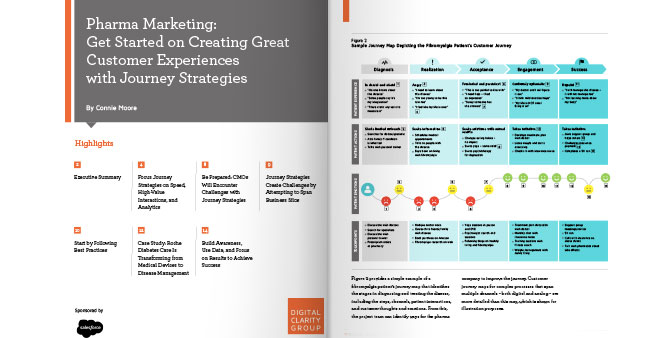
Titled, Pharma Marketing: Get Started on Creating Great Customer Experiences with Journey Strategies, this is the third B2B white paper we found on the subject of digital marketing.
This B2B white paper published by Digital Clarity Group is an about-face on what you would expect from a scientific paper. Instead of pages packed tight with 8 point type, we are hit with acres of white space and tables with a bountiful supply of background color. Weighing in at 16 pages, this white paper doesn’t waste a single word.
Overall, this beautiful B2B white paper is an example of what can be achieved when design adheres to a simple grid and choice of fonts.
Creators
Digital Clarity Group, Pharma Marketing: Get Started on Creating Great Customer Experiences with Journey Strategies
Description
A well-defined customer journey strategy is critical to customer experience management (CEM) initiatives. Yet most pharmaceutical companies have not followed the lead of industries like consumer packaged goods, retail, or travel and hospitality, which pioneered and mastered the art and science of personalized, cross-channel customer journeys.
8. DIGITAL TRANSFORMATION WHITE PAPER EXAMPLE
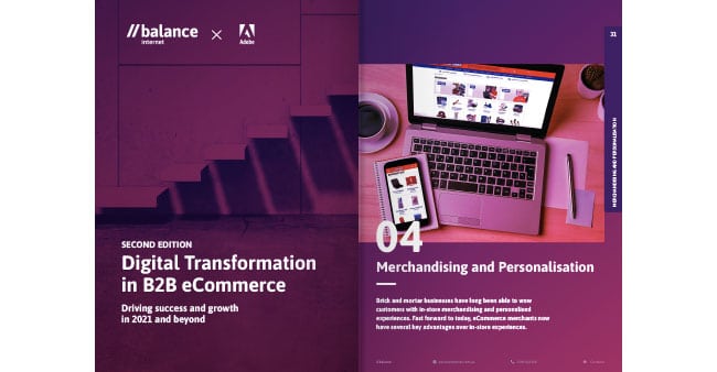
This B2B white paper published by Balance begins its story with a simple cover design made using a two-tone image. The section title pages help break up the 160-pages and create rest points in the white paper and indicate where a section begins and ends. The section pages are themed in the same two-tone image treatment as the cover.
This beautiful B2B white paper features an abundance of edge-to-edge photos. Instead of full-color photographs which can appear generic and corporate, photos are rendered in a two-tone color. A healthy splatter of call-to-action buttons allows readers to find out.
The result is a B2B white paper that invites the reader to explore.
Creators
Balance, Balance Internet launches second edition of Digital Transformation in B2B eCommerce whitepaper
Description
Balance Internet is a highly specialized eCommerce agency, and our unmatched B2B industry expertise guides our first-class digital delivery process. We are one of the most experienced B2B eCommerce solution providers in the Asia-Pacific region with members of our leadership team working in the space since 1996.
9. DIGITAL TRANSFORMATION WHITE PAPER EXAMPLE
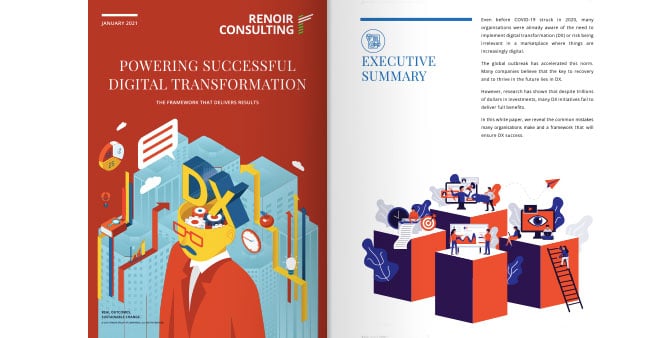
Titled, Powering Successful Digital Transformation, this B2B white paper sets itself apart from the pack with simple, bold illustrations. This white paper created by Renoir Consulting begins with a cover that makes full-page use of a simple illustration.
This beautiful B2B white paper tells its story in 16 short pages. Digital transformation can be a repetitive and dry subject matter. Here, the reader’s attention is held throughout using small simple illustrations to break up the two columns of type.
The result is a B2B white paper that can be read on a single bus ride.
Creators
Renoir Consulting, Powering Successful Digital Transformation
Description
A good plan is the backbone of every successful DX. The framework we’re detailing in this section has been distilled from our years of experience implementing digital transformation initiatives. The following pages highlight the key stages of a successful DX initiative are Define & Analyse, Plan, Execute, Implement and Continue to improve.
10. DIGITAL TRANSFORMATION WHITE PAPER EXAMPLE
Behold a simple yet comprehensive B2B white paper that expresses the subject of digital transformation through bold charts and typography. Titled, Top 8 digital transformation trends shaping 2021, this beautiful B2B white paper accomplishes its goal with very little copy.
Get ready for colorful backgrounds, big charts, and big display type. Created by MuleSoft, this white paper is living proof that a B2B white paper needn’t have copy to tell a story.
The result is a B2B white paper that reads more like a presentation.
Creators
MuleSoft, Top 8 digital transformation trends shaping 2021
Description
In a world that’s increasingly dependent on digital, IT’s role is more critical than ever. To meet rising demands, organizations are accelerating their digital transformation. This report identifies the top 8 technology trends that will face CIOs, IT leaders, and organizations in their digital transformation journey in 2021.
11. DIGITAL TRANSFORMATION WHITE PAPER EXAMPLE
Every white paper we reviewed from Google was exquisite and this B2B white paper is no exception. Since 2010 when the company changed its logo, Google has strived to brand every contact point with customers.
This beautiful B2B white paper incorporates Google’s tradition of white space, a branding mark they used as far back as the launch of Google Search. Color is applied sparingly and shapes are softened with rounded corners. Even the charts are treated with the same round corner effect.
The result is a B2B white paper that is soft on the eye despite its serious subject matter.
Creators
Google, Transforming specialty retail with AI
Description
Artificial intelligence and machine learning (AI/ML) present us with novel and efficient ways to solve challenging and persistent problems, particularly when it comes to predictions. Retail, due to its fast-moving, trend-powered, and fluid nature coupled to an extended logistics chain, relies heavily on making smart predictions.
12. DIGITAL TRANSFORMATION WHITE PAPER EXAMPLE
This B2B white paper created by SoftwareTrends is the last of five beautiful B2B white papers we found on the subject of digital transformation. SoftwareTrends publishes a lot of reports and explores software and technology trends in different industries.
This B2B white paper uses a combination of white space, soft greys, and bold charts to create a visually pleasing effect on readers. A total of nine pages including the cover, this B2B white paper is beautiful and a pleasure to read.
Creators
SoftwareTrends, Digital Transformation Drives 2021 IT Investments
Description
Digital transformation efforts continue to dominate the technology landscape as more IT leaders recognize the need to update hardware and software infrastructure to accelerate strategic products and services for the business.
13. FINANCE WHITE PAPER EXAMPLE
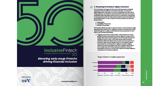
Titled, 50 Inclusive Fintech: Emerging fintechs for financial inclusion, this is the only beautiful B2B white paper we found on the subject of finance. Published by Inclusive Fintech 50, an organization funded by MetLife, Inclusive Fintech 50 sets out to help fintech startups raise capital.
This B2B white paper starts with an original cover design consisting of display type and block color. The strategic use of color continues across every page. Two simple colors are deployed with bright color accents appearing in a variety of charts.
The clever cover design is carried throughout the white paper via a grey tinted background pattern. Patterns are not a motif commonly used in B2B white papers because they can be distracting to the reader. In this white paper, patterns provide subtle resting points and tie the page to the overall message.
The result is a beautiful B2B white paper that is informative as it is appealing to the eye.
Creators
Inclusive Fintech 50, 50 Inclusive Fintech: Emerging fintechs for financial inclusion
Description
The Inclusive Fintech 50 applicant pool provides new insights into inclusion-focused fintech, itself a subset of the fintech universe. Early-stage inclusive fintechs are developing innovative products, services, business models, and distribution channels to provide solutions for underserved segments.
14. INFLUENCER MARKETING WHITE PAPER EXAMPLE
When it comes to the subject of influencer marketing, three B2B white papers stand out from the crowd. Titled, 4 Trends in Influencer Marketing for Fashion Brands to Watch out for in 2019, this is one of three beautiful B2B white papers we found on the subject of influencer marketing.
This B2B white paper is proof simplicity is key to creating a hip white paper. Block colors, warm greys for white space, and moody photographs give this white paper a youthful charm. With the single-column grid, the white paper is near mobile-first. Graphs are used sparingly and incorporate icons making every chart an original.
The result is a beautiful B2B white paper that feels more like a youth magazine. Thanks, Collabary!
Creators
Collabary, 4 Trends in Influencer Marketing for Fashion Brands to Watch out for in 2019
Description
Influencer marketing moves so quickly, and changes in such dramatic ways, staying ahead of your competition can make all the difference to your campaigns. And with 2019 set to be a remarkable year of change, development and new opportunities in influencer marketing, we have put together this white paper to share the secrets of 2019’s big trends.
15. INFLUENCER MARKETING WHITE PAPER EXAMPLE
If you believe all B2B communications are dry and uninspiring, then guess again. This B2B white paper breaks all the rules. Sometimes getting your message read means taking risks and this is exactly what this white paper on influencer marketers sets out to do.
TAKUMI, the creators of this beautiful B2B white paper, take inspiration from magazine layout. Copy is set on a three-column grid. Content is kept short and broken up with small icons, colorful graphs, and bold images.
Check out the unconventional photos taken of the creators on the back page! You could mistaken this piece as a youth magazine if it were not for the title on the cover.
This white paper gives us a glimpse of what is possible if you are prepared to forget B2B and go B2C.
Creators
TAKUMI, This Into the Mainstream: Influencer Marketing in Society
Description
TAKUMI surveyed over 3,500 consumers, marketers, and influencers across the UK, US, and Germany to uncover the latest trends in the sector. The report ‘Into the mainstream: Influencer marketing in society’, uncovered divided opinions on what consumers want to see and what brands are willing to engage with influencers on.
16. INFLUENCER MARKETING WHITE PAPER EXAMPLE
All three B2B white papers on the subject of influencer marketing have one thing in common—they borrow from magazine layout.
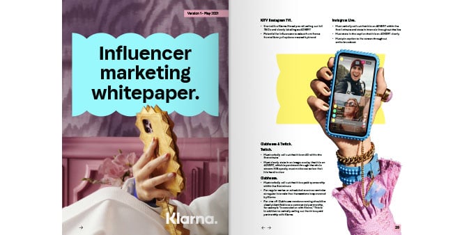
This beautiful B2B white paper titled Influencer Marketing Whitepaper is no exception, taking youth appeal a step further by incorporating deep-etched images. Instead of images being placed inside a box, deep-etched images are cut out and allowed to float across the page.
The cover concept is original and uses a cut-out vector graphic that sits behind the title of the cover. The same quirky cut-out on the cover appears throughout the white paper.
The result is a beautiful B2B white paper that is fresh and relevant to the subject matter.
Creators
Klarna, Influencer Marketing Whitepaper
Description
Klarna, the leading global payments and shopping service, and its industry-wide Influencer Council, have released their Influencer Marketing Whitepaper to serve as a guide for influencers and brands to advertise online responsibly.
17. SALES WHITE PAPER EXAMPLES
We found three B2B white papers on the subject of sales worth demoing. Created by Sociabble, this white paper sports a full-page color photograph on the cover. Equally, attention was paid to the title, Social Selling at Scale. The majority of B2B white papers we found were headlined with functional titles. Function titles are descriptive but lack emotion.
What makes this a beautiful B2B white paper is the liberal use of color. Color blocks are used as backdrops to liven up tables and as accents in the various charts which appear on the pages within.
The creators of this B2B white paper understood that pictures paint a thousand words.
Creators
Sociabble, Social Selling at Scale
Description
Social media in the enterprise has predominantly been a haven for marketers, who use its power to engage target audiences along with multiple points of the conversion funnel while being able to track the efficacy of messages and content in a very precise way.
18. SALES WHITE PAPER EXAMPLES
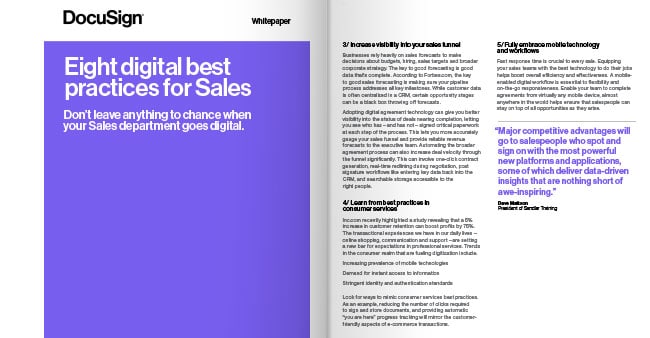
The second B2B white paper on the subject of selling is brought to us by Docusign. DocuSign kept it brief. Their B2B white paper is feather-light occupying a mere six virtual pages. Consistent with the DocuSign brand, block color appears on the cover page. To keep the copy-heavy pages interesting, this beautiful B2B white paper uses white space and colorful display type.
DocuSign proves you don’t need photos to have fun.
Creators
DocuSign, Eight digital best practices for Sales
Description
A mobile-friendly digital workflow is becoming essential to optimize efficiency and provide teams with true flexibility. This best practices paper outlines eight important ways that sales teams can make meaningful progress in their digital transformations.
19. SALES WHITE PAPER EXAMPLES
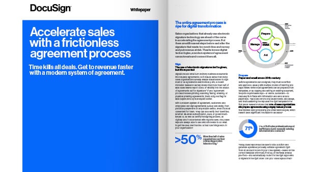
The final sales white paper example is brought to us by DocuSign. We decided to share a second beautiful white paper from DocuSign to demonstrate how impactful it can be when white papers are branded as a suite. Putting the cover designs side-by-side one can see how readers can become interested in more than one white paper.
Creators
DocuSign, Accelerate sales with a frictionless agreement process
Description
Accelerating getting it to signature and getting it closed faster, it’s all about revenue per time. If you can close the contract faster, you can close the deal faster, and book revenue faster. It also saves some effort and money in terms of calling, following up, making sure things get done, and sending emails making sure changes are sent back and forth.
20. TECHNICAL WHITE PAPER EXAMPLE
Technical white papers are notoriously short on pictures and heavy on words. This makes creating a beautiful B2B white paper that holds the reader’s attention challenging.
This B2B white paper titled Data Governance: Embracing Security and Privacy by Tealium, ticks all the boxes. Tealium accomplishes a visually pleasing and simple B2B white paper through a combination of white space, use of typography, and a simple cover design.
The cover uses a single icon and a pleasing background of blended color, while all the content pages are laid out on a single-column grid. The density of the content is offset by rending content in grey instead of black and using white space to cushion slabs of text. Color is introduced into the typography to create variety and visual interest.
The result is a B2B white paper that proves geek is no excuse for boring.
Creators
Tealium, Data Governance: Embracing Security and Privacy
Description
The General Data Protection Regulation (GDPR) will enforce all organizations to abide by specific protocols. While the principles of accountability and transparency have previously been implicit requirements of data protection law, the GDPR’s new legal framework will be critical for both businesses and consumers operating across borders in today’s digital economy to fully understand.
21. TECHNICAL WHITE PAPER EXAMPLE
We got really excited when we found this B2B technical white paper by Facebook. We wanted to know how Facebook would go about tackling a technical white paper. The creators of this B2B white paper did not disappoint.
This beautiful B2B white paper titled Charting a Way Forward Online Content Regulation is successful because, like the white paper by Tealium, it uses a combination of clever cover design, white space, and type to hold the reader’s attention.
The result is a B2B white paper that is simple but identifiably Facebook.
Creators
Facebook, Charting a Way Forward Online Content Regulation
Description
This paper explores possible regulatory structures for content governance outside the United States and identifies questions that require further discussion. It builds off recent developments on this topic, including legislation proposed or passed into law by governments, as well as scholarship that explains the various content governance approaches that have been adopted in the past and maybe taken in the future.
22. TECHNOLOGY WHITE PAPER EXAMPLE
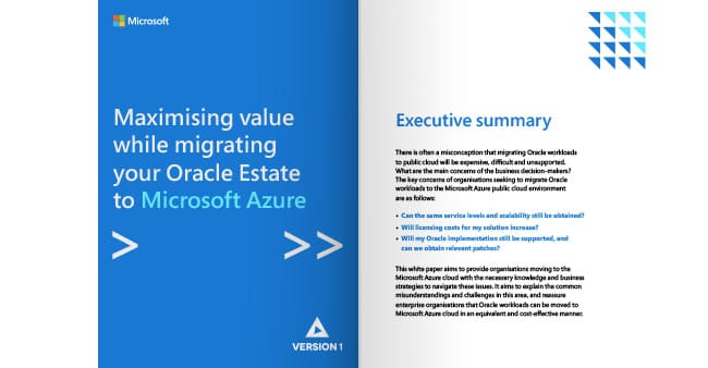
We were hard-pressed to find a beautiful B2B white paper from Microsoft. That was until we stumbled upon Maximising value while migrating your Oracle Estate to Microsoft Azure. Azure is one of Microsoft’s more popular products so it was fitting the white paper was a cut above the rest.
The cover design is simple and makes use of Microsoft’s blue in a block color. Content is set on a one-column grid and each page is adorned with an icon placed in the top right-hand corner.
The result is a B2B white paper that is professional and clearly Microsoft.
Creators
Microsoft, Maximising value while migrating your Oracle Estate to Microsoft Azure
Description
This white paper aims to provide organizations moving to the Microsoft Azure cloud with the necessary knowledge and business strategies to navigate these issues. It aims to explain the common misunderstandings and challenges in this area and reassure enterprise organizations that Oracle workloads can be moved to Microsoft Azure cloud in an equivalent and cost-effective manner.
23. TECHNOLOGY WHITE PAPER EXAMPLE
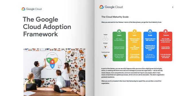
Earlier we showcased a beautiful digital transformation white paper by Google. This technology white paper example is also brought to us by Google. Titled The Google Cloud Adoption Framework, it’s every bit as good as Transforming specialty retail with AI. Side-by-side one can appreciate the restraint with which Google creates its B2B white papers.
White space is available from cover to cover and the same signature rounded corners appear in a variety of design elements.
Creators
Google, The Google Cloud Adoption Framework
Description
The Google Cloud Adoption Framework builds a structure on the rubric of people, processes, and technology that you can work with, providing a solid assessment of where you are in your journey to the cloud and actionable programs that get you to where you want to be. It’s informed by Google’s own evolution in the cloud and many years of experience helping customers.
24. TECHNOLOGY WHITE PAPER EXAMPLE
Apple has a reputation for designing products right down to the screws they use during assembly. The same attention to detail Steve Jobs fostered in the company can be found in their B2B white papers.
Title Mac Pro Technology Overview, this B2B white paper is almost entirely rendered in black and white. It is testimony that even a white paper should receive the same design consideration as the flagship product — the G5.
The cover design features a back and white photograph taken of a product taken from two angles. A simple one-column grid hosts the majority of the words. Hanging in the margin are more tasteful black and white product shots.
The result is a beautiful B2B white paper that feels like you’re unboxing an Apple device.
Creators
Apple, Mac Pro Technology Overview
Description
Mac Pro was developed with a singular purpose: to enable professionals to do their most demanding work without constraint. It’s designed and engineered to enable a wide range of different uses and presents virtually unlimited possibilities for customization and expansion.
25. MARKETING WHITE PAPER EXAMPLE
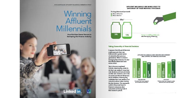
Mysteriously we found only one example of a marketing white paper worth sharing. Published by Linkedin, this B2B white paper grabs your attention from the cover. The cover design features a full-page photograph marked with Linkedin’s colors.
However, it was the illustrations and charts that caught our attention and had us label Winning Affluent Millennials Research Whitepaper as a beautiful B2B white paper. All the charts are original and hand-drawn. Bite-size illustrations feature in unexpected places like tables and in display type.
The result is a beautiful B2B white paper where turning every page brings a new experience.
Creators
Linkedin, Winning Affluent Millennials Research Whitepaper
Description
It appears that Affluent Millennials might approach their own finances with a greater sense of ownership than previous generations. When it comes to managing their finances, it’s clear that Affluent Millennials want more control.
CLOSING REMARKS
When we examined the criteria for deciding which white papers to showcase, we discovered the following three design elements featured at least once with each white paper we reviewed.
We shouldn’t judge a white paper by its cover. Unfortunately, this kind of discrimination is practiced daily. At a glance, readers decide if a white paper is worth their time downloading and sharing. The more attention 😲 getting the title and cover graphic, the more chance a white paper is downloaded.
The use of a grid gave white papers order. They appeared more structured and organized compared with white papers using no grid. Disorganized content 🍕 is hard to read at length and may lack credibility.
Color is an easy way to make a difference. We often found that creators of these B2B white papers used color in conjunction with one or more other design elements such as the cover, tables, or illustrations.
Interactive buttons designed to drive readers from the white paper to another page were not widely practiced. We cited one white paper using this technique.
Unfortunately, while one B2B white paper was near mobile-first, none of the white papers we found were mobile-first. Mobile-first or responsive white papers can be exploited by marketers to get more readers to consume their white paper from a mobile phone or tablet.
B2B WHITE PAPER RESOURCES


